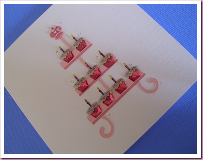
Hmmmm …… I am a bit disappointed with this card – I was going for the less is more effect, but less isn’t quite enough, if that makes sense?

There is a suggestion box on the Quickutz Silhouette download site where you can ask for new designs, I asked for a cake stand, as they are so "in" at the moment and got one!

It does look rather stark, I wonder if it wouldn’t have looked a little softer if I had used puffy stickers instead of these quite harsh plastic cake embellishments and then perhaps placed the design on a bit of mat and layering ………….
As it happens .... I put the card in my staffroom box and it was one of the first to go, I'm just to critical!
As it happens .... I put the card in my staffroom box and it was one of the first to go, I'm just to critical!
I love it as it is ...a different look to your matted ones ....less is more.
ReplyDeleteI think the cakes are perfect, but I do think matting it would ground it to the background. I have the pouffy cupcakes stickers from paperchase and i dont think they would look as good as the ones you have used here.
ReplyDeleteI thionk it's great! Sorry to sound daft but the Quickutz Silhouette that you refer to, is this a similar sort of thing to a normal die-cutting machine but with downloads instead of dies? Sorry to sound silly but I am really keen to buy a Bigshot but this looks quite good.
ReplyDeleteThanks x
I think it's just right, and as it was the first to go in your staffroom what does that tell you? It's lovely!
ReplyDeleteLuv L xx
yummmmmy i love this one!
ReplyDelete