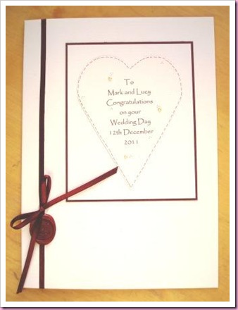
Less is more today, with a design I have used/shown several times before, but in a different colour way. My sister-in-law asked me to make a wedding card that reflected elements of a wedding invitation she had received. The basic colours being ivory and burgundy. You can’t see very clearly but I’ve added three very tiny flat backed pearls on the printed heart and burgundy faux stitching.

As a finishing touch I’ve added a seal that was originally on the invitation envelope to the card.
Very classy looking and ticking all the required boxes I think. Looks like my favourite font too, Papyrus.
ReplyDeleteToni xx
i love it and the seal is a nice touch big love marc
ReplyDelete