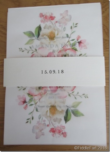
This is the wedding invitation pack I “made” for my nephews wedding this coming September.
As you can see there isn’t really any crafting to them. The bride was very specific in her desire for an invitation made up of several layers of cards, that were plain, simple and classy, which probably accounts for them taking 3 months from the first moot to my being able to finally pack them in a box (with spares in case of accidents) and posted! It also didn’t help that I am in Evesham while the bride and groom are in Stockport and that we never actually spoke in person throughout the whole procedure other than texts and e-mails.
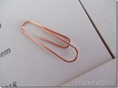
The band was always a requisite, and probably the fiddliest part as it needed an extra bit added in order to fit round the completed invitation pack including a hidden paper clip, with precision folds.

Before arriving at this final white linen effect band (the card used throughout the project from Papermill Direct) I sent samples in pink and grey, also making pink, grey and white stamped seals using my Melt Pot. These ideas were quickly cast aside, as were the subtle placement of the odd “posh” flatback pearls and gems and requested vellum wraps. We also toyed with putting the name of the bride and groom on the band but Amanda also discounted this because they couldn’t be centred aesthetically, Joe having less letters than Amanda.
The rose coloured paperclips (Paperchase) were originally meant for the Save The Date cards that I had made previously, but they didn’t really go with the grey card used, but happily worked a treat under the band ….. so much attention to detail!
The font was also an important consideration, there were two in the running, but in the end it was Cochin LT that made it through, sourced by the bride and groom and then downloaded by me. I had never seen or heard of it before.

The main headings of the invitation were set out in capital letters with a space between each letter and then the body of all the cards were in smaller italic.
To be honest the whole exercise reminded me of my working days when I used to spend a lot of my time creating forms, leaflets and work sheets in Publisher 2003. It’s all about hidden text boxes, spacing and then centring. The Response Card took me the longest to put together for that reason.
The final piece of the puzzle (everything came in bits over the months) was right at the end with the cover design (again sourced by Amanda), printed, after a little experimentation on Crafters Companion printable vellum. Then when everything was double checked and then double checked again, I was able to start printing and then cutting all the components parts to size before putting each pack together, this took me a weekend to do.
Did I enjoy the process? Perhaps not …….. but it was my wedding present to the couple. It didn’t particularly get my creative juices flowing and to be honest could have easily been done at a printers, however, as a spin off my sister-in-law (the bridegroom’s mother) has asked if I can make her a wedding card incorporating the floral design and then a framed version for a keepsake …… so perhaps I can add my own touch of fiddle fart somewhere along the line, if not wholly endorsed by the happy couple!


