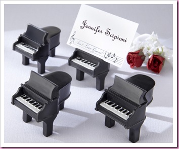
A very musical colleague at work showed me the picture below of a wedding favor she fancied, but the groom had said “no!”

But as a compromise she asked if I could “do” a similar place card. Below is what I came up with…(I hope my illustration makes sense)

It took a lot of fiddle farting on Publisher, but I sorted it out in the end, getting six place cards on one sheet of A4 card. The music I’ve used is one of the opening bars to Wagner’s Wedding March, and is on the front and back of the card, so the design can be seen from both directions.
As a finishing touch I have added a very small, sparkly flat backed gem just before the end of the music on both sides of the card.

As my sister would say ….. “It’s all in the detail”

12 comments:
These are lovely and I'm full of admiration as I know what fun it can be to line things up in Publisher!
ps I just knew you'd put a sparkly bit in there somewhere ;) but it does just finish it off
Fantastic, very professional. I've never thought of doing place cards in Publisher as I make wedding stationery for family & friends. I'm going to 'have a play' today and see how I get on. Thanks for the inspiration.
Really like these, and the gem finishes them off beautifully!
Oh these are fantastic!!
I have to make my sister's and never thought to do them on the pc - fab!
These are gorgeous. Very elegant
Hugs
Suzanne x
Fantastic cards - what a clever idea.
Damn - why is no one I know getting married?
Nice work, girl!
What a great idea, they are gorgeous.
twiggy x
They are beautiful, very classy, well done!
They are gorgeous, well done :)
C
xx
Very classy Helen, they look lovely.
Toni :o)
fantastic. I've been setting templates up for things such as this in publisher and word and know all about the hard work involved. These are great.
Paula x x x
Post a Comment