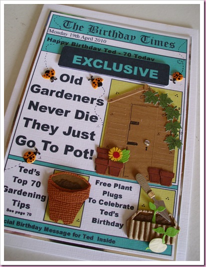
I don’t usually make repeat card orders, but when I was asked to make two cards for the same day, the same age and with the same interests, it seemed barmy to do two completely different cards …..
The very small pots and leaves on the shed are made using punches.
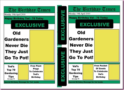
I used my newspaper template card – the picture below shows how it looked when I printed the fronts on A4 linen card stock. As I was using embellishments on the cards I filled text boxes to use as backgrounds. On most newspaper cards I put photo images in these spaces and make simple decoupage layers for extra dimension.
I got the ladybird stickers from Morrisons (99p)
I admit to making extra work for myself by cutting the garden sheds out on my Quickutz Silhouette as I just couldn’t find the right image for what I had in mind.
In answer to a couple of questions...
The template is something I have designed myself in Publisher, with every design I have to jiggle about with it, but the headings and basic layout generally stay the same.
When I have finished the card design I save it as a jpeg, and insert it onto a new page in Publisher, set on landscape, so it is roughly A5 in size, this is the base of the car., I then copy the image several time to crop the various parts I want to use for simple decoupage layers. When all this faffing is done, I cut it all out, mounting the main design on a blank A5 card and layer the smaller bits on to it. A bit long winded I know, but it works for me.


3 comments:
They look great (as always :)) - Your newspaper template is that a download off the internet - or something you designed yourself???
i love your newspaper designs and have borrowed it for a card for my husband but i managed to create in microsoft word. I think you are just so talented - i must be one of your biggest stalkers, i mean fans LOL!!!
Paula x x x
your newspaper design really rocks and it is so cute. I love everything about it but I only have an a4 card available so i'll just resize it then since I want to make a card inspired by your design. :)
Post a Comment