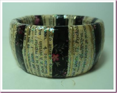
Hmmmmm not sure about this, I wanted the bangle to look all light, pretty and delicate, but instead it’s turned out very dark and heavy looking ….

It started out as a bangle from Primark bought in a sale for. I’ve covered it with strips from a page from a really old dictionary, then added a few ragged strips of a black Decoptach paper, plus some gold adhesive strips and a little Stampin’Up Dazzling Diamonds, followed by several coats of very glossy clear glitter. It’s too ugly for me ….. oh well it’s back to the drawing board.
9 comments:
It's fascinating to see your altered items, you have such good ideas! Even when they don't work the way you intended they are always interesting. (And the original bangle is hideous, I think - your alterations have definitely improved it!!)
love Mags B x
I think your version is a vast improvement - I quite like it.
I think you made the right decision to let your scheduled posts be published. All your work would have been wasted if you'd cancelled them all. Hope you're coping ok.
Hey, I've nominated you for the Sunshine Blogger Award! I hope you take part, but you don't have to if you don't want to! Check out my post here http://thisisthecraftyone.wordpress.com/2012/06/07/a-little-bit-of-sunshine/
Well, I like it - even if it's not quite what you intended it to look like when you started - and it's a vast improvement on the original bangle!
Definitely an improvement on the original.
Toni xx
i quite like it as i bet its glittery in the right lighti could see it with a little black dress big love marc
I think it looks 'vintagey'. xx
I love the bangle, but if you wanted something lighter remember to start very light because the minute you add a liquid to the paper it darkens it.
I really like what you have done and as everyone else has said, it is a vast improvement on the original! I've never tried decopatch - don't know if I'd really know where to start! :(
Lynda xx
Post a Comment